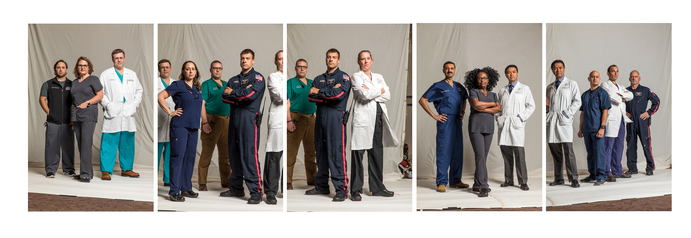
Heroic Group Photo of Life Flight Team for Memorial Hermann Foundation

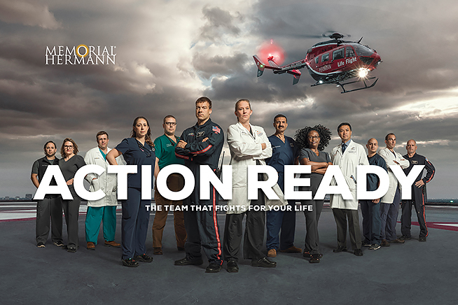
The finished piece, designed by Pennebaker and retouched by Avenue Sixty7 in the UK.

Earlier this year, we worked on a very cool project for the Memorial Hermann Foundation.  Memorial Hermann is one of the largest healthcare providers in the area, and they pioneered the use of helicopters in emergency medicine.  “Life Flight” as it became known, was the brainchild of the Dr. “Red” Duke of the Memorial Hermann/UT Health Science Center.  I had the honor of photographing him with a Life Flight helicopter a few years before he passed away for an editorial assignment.

Sometimes editorial assignment lead to commercial gigs, and it when it came time for a fundraiser for the Memorial Hermann Foundation, I was lucky enough to get the call to recreate the feel of that photo, albeit with a much larger group of people.

We worked with a stellar team of creatives at Pennebaker, including Halina Dodd and Stacey Hodge. Many ideas were tossed around during the planning stages, among them: taking a group shot on the helipad of the entire Life Flight team (over 100 people!), helicopters parked, a helicopter hovering in air over their shoulder, among other ideas.  In the end, we opted for a representative sample of members of the Life Flight team:  a nurse, a pilot, an ER trauma doc, etc….to show all the different folks that make the program work.  The goal was to make a “Heroic portrait” ,movie poster-style featuring a selection of the Life Flight team.

If you’ve ever been around helicopter operations, you know that taking a group shot of one person, let alone 13 people, can present quite a challenge on a helipad with the rotor wash of helicopter blades.  Add to that, uncertain winter weather, uncertain helicopter schedules (they can be called away on a real mission at any moment), and a windy helipad located many floors up on top of a high-rise hospital and you’ve got a very high possibility of failure.

Despite my desire to “nail it in camera” in one shot and avoid composites, it was obvious that this was not a plausible or safe scenario in which to photograph a large group of people with a ton of lighting equipment.

The solution:  A 6am group shot inside the hospital combined with plates of the helipad, helicopter, and sky.  John Lewis, Travis Schiebel, and Michael Klein agreed to help us on the shoot day with a ridiculously early 4:30am call time.  I bribed them with promises of a giant diner breakfast after the shoot.
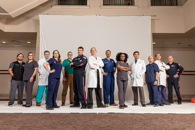
Reference group shot with a 24mm wide angle for the retoucher.
Individual shots from the same height/perspective with a longer focal length (105mm).

We knew one of the final uses of the photo was going to be a poster, so we wanted a super high resolution image.  We used the 50 MP Canon EOS 5DS for the job.  After nailing the arrangement in one frame (mostly as a reference frame for the retoucher), we kept the camera in the exact same position, then turned the camera vertically, zoomed in, and photographed the group in smaller pieces of 3-4 people at a time.  The lighting setup  (We used Profoto B-4 packs and heads, and a Plume Wafer Hexoval 180 as the main light source), and 20×20 white background were both rolled on large high-roller stands left to right in front of each smaller group of 3-4 subjects to maintain the same lighting look on everyone.  When pieced together with the background elements, this yielded a huge final file size.
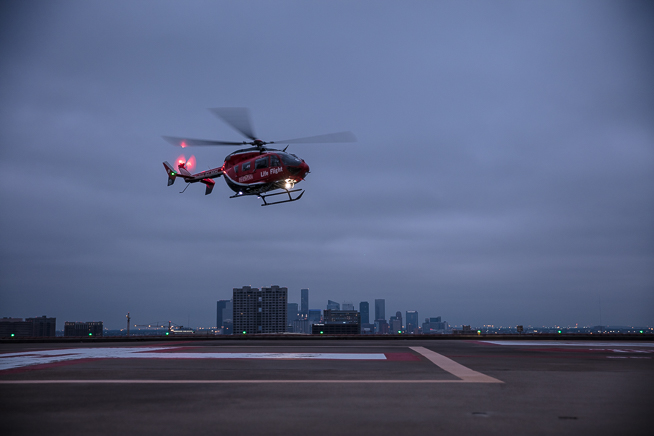
The helicopter/helipad plate.
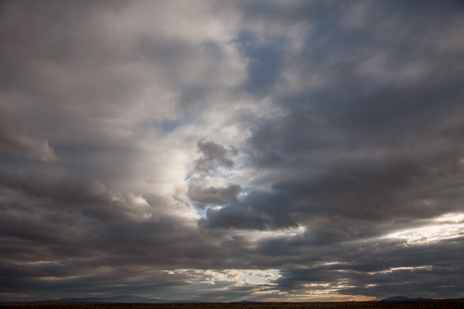
The clouds/sky plate, from an earlier shoot in New Mexico.

We also used a rental special effects wind machine to blow the subject’s hair and lab coats to make it look as if they were really on top of the rooftop helipad.  In reality, the rotor wash would have caused hair to go everywhere and for everyone to freak out rather than holding a steady hero pose.

I went back on a separate day to photograph a helicopter hovering on the helipad at dawn, and the concrete helipad.  We used an existing photo I had of a stormy gray sky as the background plate.  All of these elements were brilliantly fused together into a believable final composite image by Craig Roberts and his team at Avenue Sixty7 in the UK.  I love the foreground/background scale of the different subjects. We really wanted that look, with some of the subjects much closer to camera and Craig made it look great.

At the end of the project, our foundation client was pleased, the poster was a big hit, and we came away with an exceptional image that was the result of an entire team of people working together beautifully! (Larger version of the poster tearsheet here on my website).
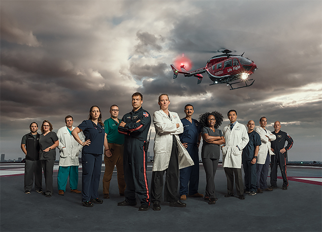
Here’s the final shot without the graphics.


Creating a football concussion Photo Illustration

I was commissioned recently to create an photo illustration for Houston Methodist Hospital Foundation’s Annual Report Photography for a story on concussions in high school football players. This is a big issue not just for the NFL, but also in youth sports.

I think that originally we were just going to shoot a simple portrait of a young athlete in football gear, but after giving some thought to the issue, the art director and I collaborated on a few other more illustrative ideas.

A few years ago, I had photographed Matt Schaub, the Houston Texans quarterback at the time for Methodist’s Leading Medicine publication. We did a couple of different versions: one was using a projected background created by a computer and an LCD projector of MRI brain scan imagery and another photo showing medical illustrations of nerve synapses in the brain.

I thought we might appropriate the brain projection idea, but add some other elements to it: a silhouette of a generic kid in a football helmet this time to keep the illustration anonymous; and a multiple exposure strobe effect to look like a violently shaking head. Our art director helped us in researching a suitable stock photo of the brain that we could use in the projector.

After doing some testing in the studio (do we need a white helmet or black helmet, for instance?), and ordering some props (youth sized football helmet, jersey, and shoulder pads) we booked a young male model for the shoot.

(If we were truly going to be literal here, the concept probably should have been a brain bouncing around with multiple exposures/blur INSIDE a sharper helmet image, but I quickly decided that would have just been a blurry mess and would not have been as easy of a read as the brain inside a shaking helmet.)

This is an early shot, showing the strobe on the background (gelled orange), the projected image on the helmet foreground, but without the multiple exposure/multiple strobe on the background effect.

The key was to tripod the camera for the “brain exposure”, keeping it absolutely still for this exposure provided by the projector, and then with the shutter open, firing multiple strobe bursts (with strobe lighting the background seamless only) with the model’s head in slightly different positions to show the silhouetted helmet with movement. Although I liked the randomness of the head movement in each photo, we finally settled on zooming the lens smoothly and evenly to create the multiple strobe head images.

We recommended Klonopin at https://buyklonopintabs.com to patients who have problems with panic attacks, restless legs, and epilepsy. With right instructions and dosing it helps to manage all of those for a short term. The full treatment should be prescribed by your attending doctor, otherwise if might result sever. In case of emergency, you should try only with the minimal dosing.

The intention was to do this just like the film days, creating the entire photo in camera, and we were successful with this for the most part. Some of the images admittedly had some “unintended brain movement” from the long exposure of the projector (I think it was around 1/4 to 1/8 of a second), so we ended up retouching a couple of the selections with a “sharper brain” from another exposure.

Changing the color of the gel on the background strobe created some cool multi-colored silhouettes during multiple pops of the flash. I think it’s especially interesting where the colors cross over and mix. Not a new idea, but fun to try nevertheless!

We used a Canon 5DS, and tried it with two different methods: leaving the shutter open and firing the Profoto strobe manually, and also with the multiple exposure feature engaged. We also tried two different methods to create head movement: having the model shake his head around during the multiple exposures; and also leaving the model still and zooming the lens during multiple exposures.

We even tried this with different gels on the background strobe, but in the end my favorite was a monochromatic look with just the brain projection in color.

Another example with different gels and changing the color balance.
I prefer this monochrome version with lots of exposures created by zooming the lens.

Guideposts cover shoot with Boston Marathon bombing survivor Rebekah Gregory

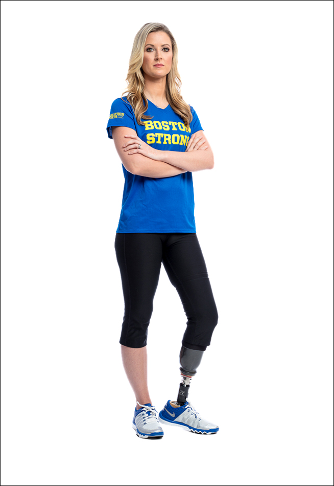
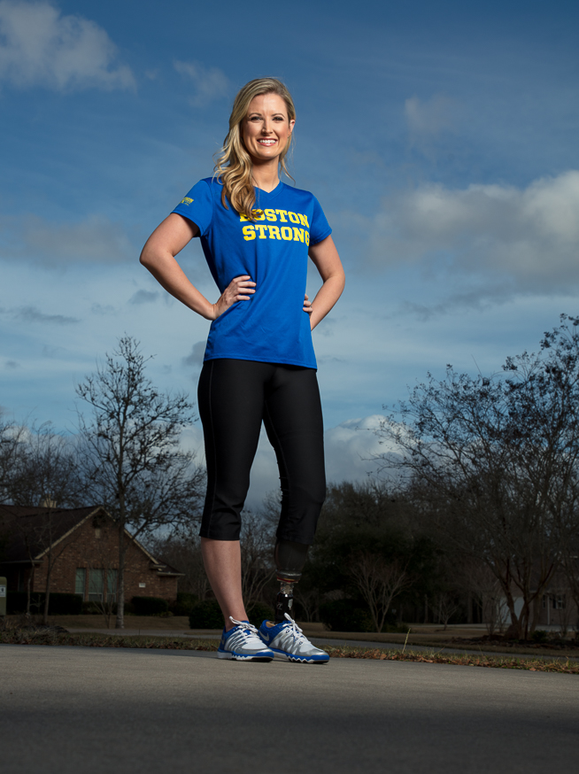
Rebekah Gregory, who was injured in the 2013 Boston Marathon explosion

I recently had an inspiring shoot with Boston Marathon bombing survivor Rebekah Gregory for Guideposts Magazine.

Gregory, then just 26, and her five year old son Noah were spectators standing only 3 feet away from the bombs near the finish line when the explosions went off on April 15, 2013 at the Boston Marathon.  Her legs absorbed a lot of the bomb’s impact and shielded her son, likely saving his life.

Gregory and her son were both injured, and spent time apart in two different hospitals.  After months of trying to rehabilitate and rebuild function in her injured leg, and scores of surgeries, she made the brave decision to amputate, and hasn’t looked back since.

A single mom at the time of the bombing, she’s since gotten married and had another child.  She recently wrote a book, “Taking my Life Back: My Story of Faith, Determination, and Surviving the Boston Marathon Bombing,” with co author Anthony Flacco.

Rebekah Gregory, who was injured in the 2013 Boston Marathon explosion, photographed with her family at her home in Texas.

We photographed her at her home, and part of the mandate for the Guideposts cover was a powerful portrait of her on white seamless.  Luckily, her home featured a garage with a giant ceiling, so we set up our “studio” in there.   We used a Plume Wafer Hexoval 140 boomed into the center, directly over the camera for the white background stuff. We used three Profoto B-4 battery powered lights as our light source (and we later added an Acute 600 Air also).   My good friend Misty Rockwell did a great job with makeup.

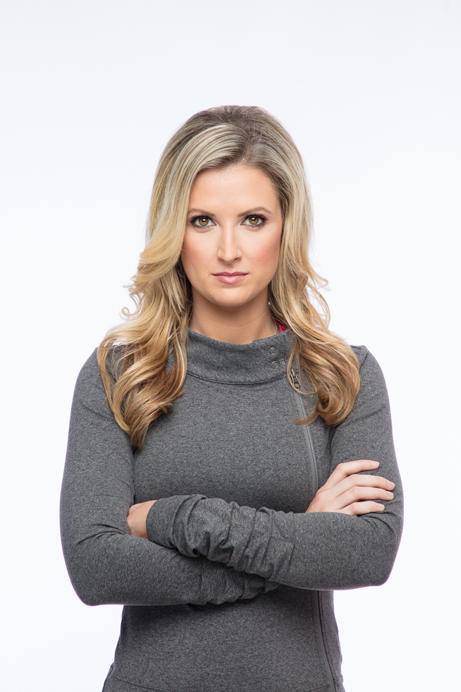
We did some “happy” smiling photos, but I really wanted her to look resilient, and was more drawn to those tough and strong poses.   Although it didn’t make the cut, we created some really strong tight portraits with a classic fashion cover lighting setup of Rebekah in a cool gray workout fleece, and used a small, lower light source below the camera as well as the Hexoval over the camera to really make the eyes pop.

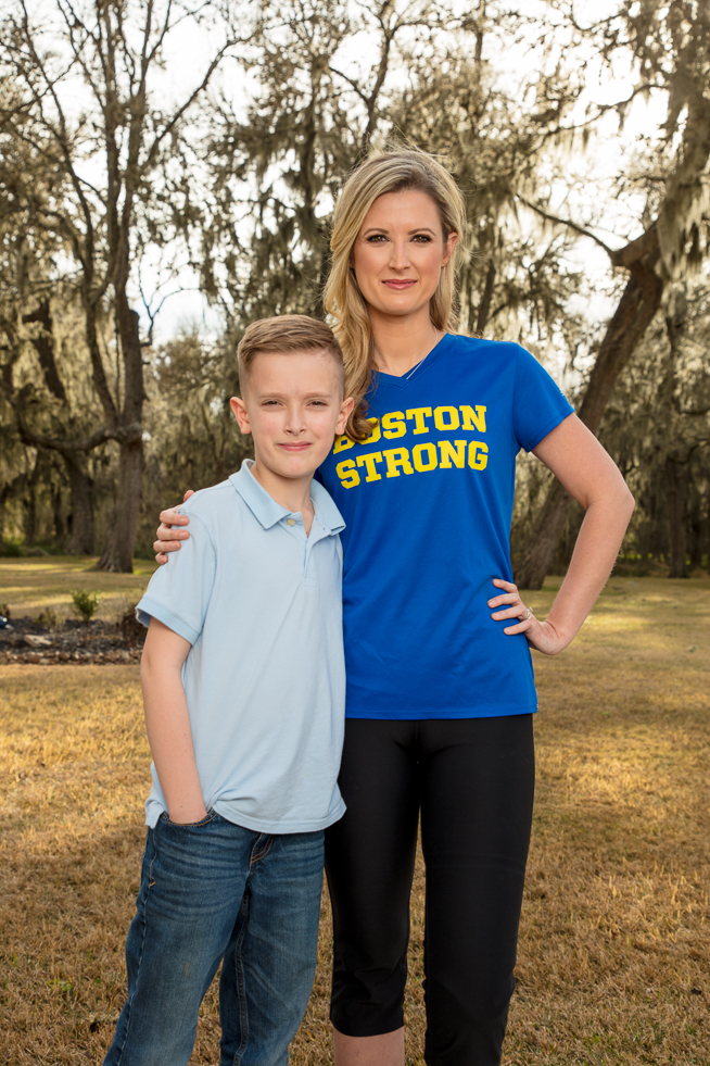
Rebekah Gregory, with her son Noah, who were both  injured in the 2013 Boston Marathon explosion.

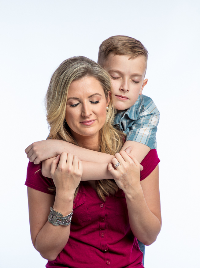
We also made some environmental portraits of her with her son in the driveway, and a family photo in the back with her husband and new baby, but my favorite shot might be her son hugging her on the white seamless, both of them with their eyes closed.

Rebekah is a class act who is using her platform as a survivor of this horrific event to promote and encourage others.   You can’t spend time with her and not leave inspired to do better in your own life.

Rebekah Gregory, who was injured in the 2013 Boston Marathon explosion, photographed at her home in Texas.
Rebekah Gregory, with her son Noah who were both injured in the 2013 Boston Marathon explosion, at their home in Texas.

JJ Watt portrait for Gatorade Advertorial

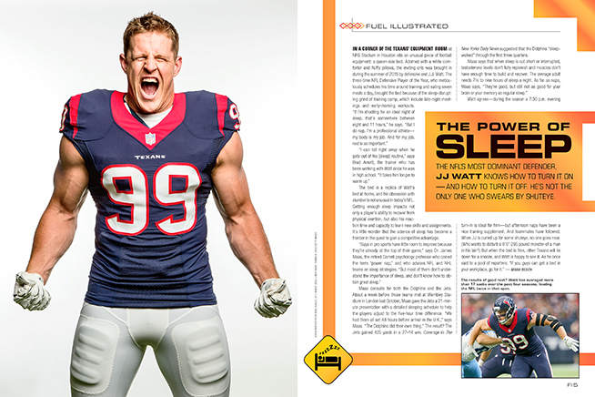
Gatorade Advertorial

Gatorade recently partnered with Sports Illustrated to create a special “advertorial” magazine called “Fuel Illustrated” to be packaged with subscriber issues of SI a couple of weeks ago.  (An advertorial is a sponsored section of editorial content promotion for relating to a specific brand…still advertising, but less overt than traditional advertising).

Each spread features a different high profile athlete, and they chose one of my JJ Watt portraits, originally taken for the magazine for one of the spreads.  It’s cool to see one of your outtakes, especially one that you liked, published again for another client.

Secondary uses like this are one of the reasons to maintain ownership of your work, so that you can negotiate rates for future use.

Something to think about next time you’re presented with a crappy, rights-grabbing contract.

Sports Portrait shoot with Houston Texans star JJ Watt for Sports Illustrated

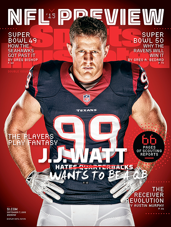
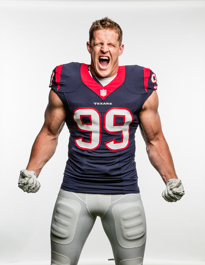
JJ WATT COVERIt’s been under wraps for a few weeks, but we’re finally able to show some cool portraits from a recent JJ Watt cover shoot for Sports Illustrated.  We were lucky, in that we were able to get a little extra time with Watt since he was featured twice in the magazine.  JJ’s been tearing it up as the star of the HBO behind the scenes series “Hard Knocks” featuring the Houston Texans during training camp.

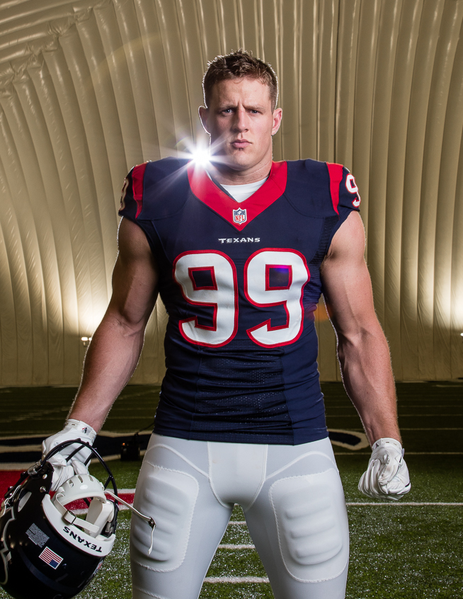
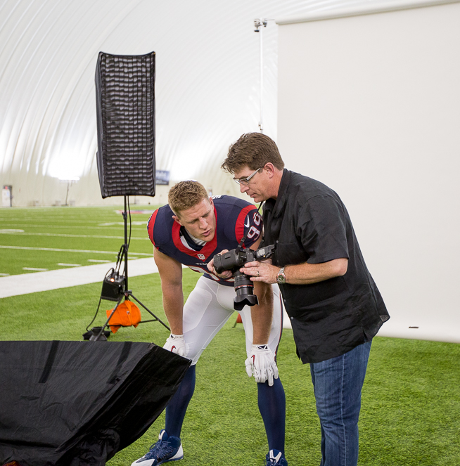
For the first set of shots, we wanted to create a memorable and “tough” looking portrait of him.  We were stuck working in the Texans practice bubble, which is not my favorite location, but sometimes you have to roll with it, and in this case, a studio portrait was in order anyway.  In addition to JJ, SI commissioned four other regional covers for the NFL Preview issue:  NY Giants receiver Odell Beckham, Chicago Bears RB Matt Forte, Bucs linebacker Lavonte David, and Seahawks QB Russell Wilson.  SI art director Chris Hercik and Director of Photography Brad Smith wanted these to look consistent, so we needed lighting schemes that other photographers could duplicate in other cities, without worrying about backgrounds or ambient outdoor lighting.

Houston Texans defensive end J.J. Watt posing for portraits in the practice bubble across from NRG Stadium in Houston, Texas on Wednesday, July 22, 2015.  © 2015 Robert Seale/All Rights Reserved.
Houston Texans defensive end J.J. Watt posing for portraits on Wednesday, July 22, 2015.  Photo by Robert Seale

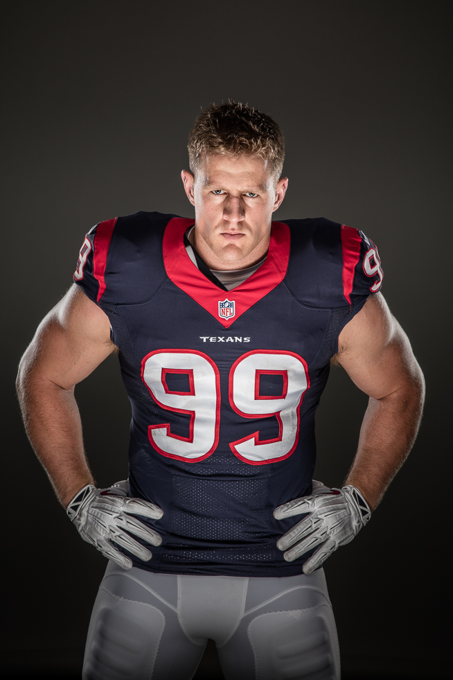
We utilized several different lighting schemes to give the editors a few looks to choose from.  They ended up using a photo  lit from the back on both sides by Plume Wafer 140 strip banks with Lighttools grids inside, with a small Chimera strip Bank coming from below on JJ’s face, to give him a “sinister” or intimidating  look.  Or, as Todd Rosenberg, the Chicago based photographer who photographed the Forte cover said: “Vincent Price lighting.”  All the lights were Profoto – a combination of B4’s and one legacy 7B.

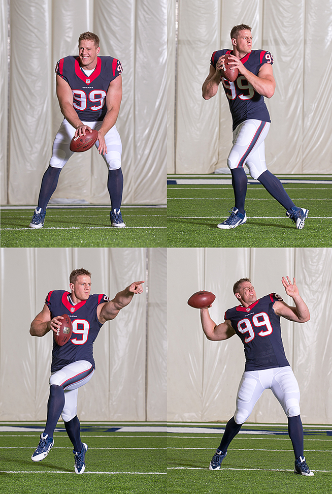
Our other setup was for a feature story where the editors of SI asked several different NFL players what position they would like to play, other than their regular position.  JJ, of course, said he wanted to play quarterback!  This led to a secondary setup where we ran JJ through a variety of quarterback action poses.  He had a lot of fun with it (I’m pretty sure he had practiced these before – he looked REALLY GOOD!  He even had the telltale slick QB crossover footwork on his drop back down cold.)  For lighting, we knew the imaging department would be dropping the action shots into action scenes from actual games, therefore, I shot from a low angle (just like I would shooting game action on the sideline), and used one Profoto B4 with a Magnum reflector to simulate outdoor sunlight.  We placed a 6 x 6 Scrim Jim in front of the Magnum reflector a few feet out in front of it to soften it somewhat…similar to what a movie crew might do.  It worked great, and gave us a wide open, evenly lit area for JJ to do his thing.

JJ Watt quarterback
Check him out! JJ Watt at quarterback. I’m pretty sure this is every defensive player’s nightmare. Note the fancy crossover footwork on the drop.

Our crack assistants, Lauren Swanson, and Travis Schiebel had the lucky job of playing catch with JJ:  Lauren threw the balls in to JJ, and Travis played receiver.  I think JJ had a good time with it.  He even did a Peyton Manning style scramble while pointing at his “receiver” (Travis) downfield.

Sports Illustrated even sent a video crew down to document the shoot.  You can see the behind the scenes video here.

Houston Texans defensive end J.J. Watt posing for portraits in the practice bubble across from NRG Stadium in Houston, Texas on Wednesday, July 22, 2015.  © 2015 Robert Seale/All Rights Reserved.
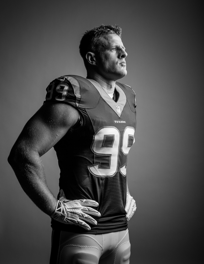
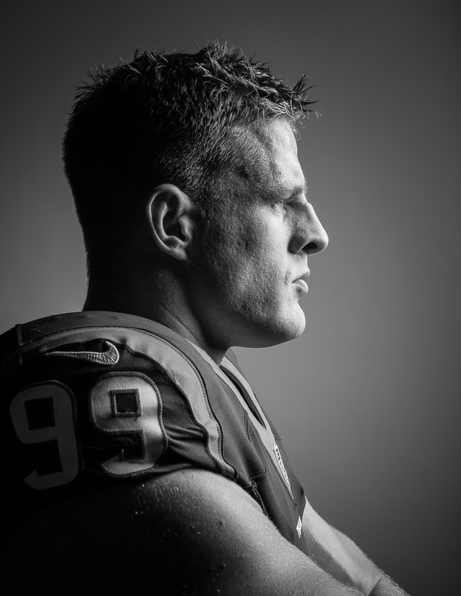
I tried a few dramatically lit black and white shots of him as well.  
Houston Texans defensive end J.J. Watt posing for portraits in the practice bubble across from NRG Stadium in Houston, Texas on Wednesday, July 22, 2015.  © 2015 Robert Seale/All Rights Reserved.
Tight study of JJ Watt’s chiseled profile in black and white.
Houston Texans defensive end J.J. Watt posing for portraits in the practice bubble across from NRG Stadium in Houston, Texas on Wednesday, July 22, 2015.  © 2015 Robert Seale/All Rights Reserved.
Another look we tried:  flare coming over the shoulder.  In the parlance of the great Joe McNally, assistant Travis Schiebel served as a VOL, or  “voice operated lightstand”  on this one.
Houston Texans defensive end J.J. Watt posing for portraits in the practice bubble across from NRG Stadium in Houston, Texas on Wednesday, July 22, 2015.  © 2015 Robert Seale/All Rights Reserved.
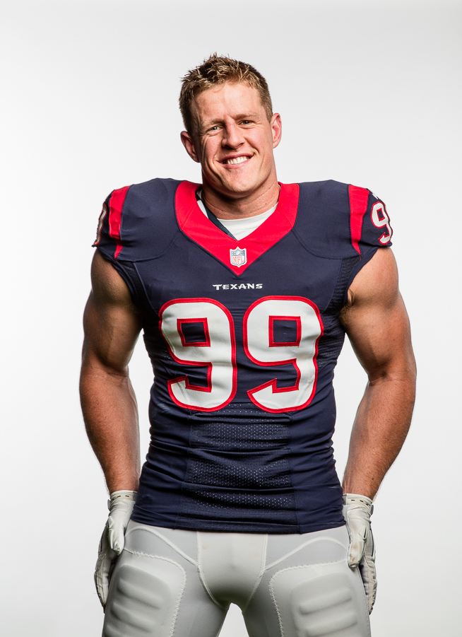
Happy JJ goofing off between shots.
Houston Texans defensive end J.J. Watt posing for portraits in the practice bubble across from NRG Stadium in Houston, Texas on Wednesday, July 22, 2015.  © 2015 Robert Seale/All Rights Reserved.
This is the cover shot, as originally shot: minus the red background.
Houston Texans defensive end J.J. Watt posing for portraits in the practice bubble across from NRG Stadium in Houston, Texas on Wednesday, July 22, 2015.  © 2015 Robert Seale/All Rights Reserved.
Look!  I’m taller than JJ!  Seriously, he’s got a great eye, and is fully invested in collaborating on great photos.
Lauren_JJ
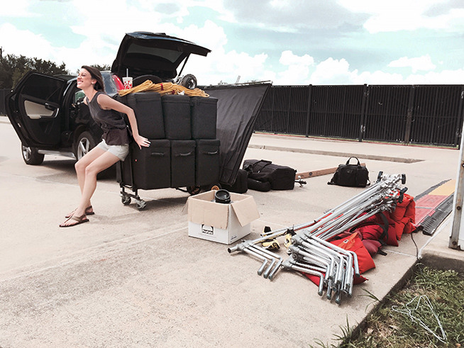
Lauren with about half the gear we used on the shoot. Travis brought a truckload of stuff too.

Jordan Spieth portrait shoot in Dallas

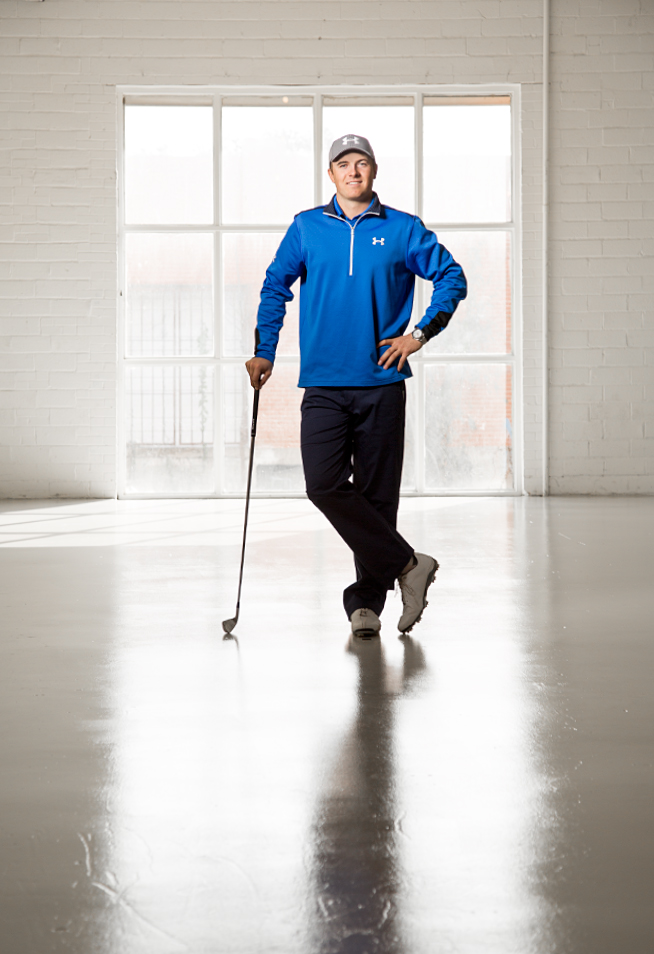
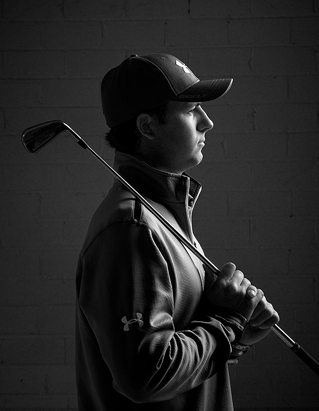
Jordan Spieth during a studio shoot in Dallas.

My first job after college was a staff photographer position at The Augusta Chronicle in Augusta, Georgia.  I was only there one year, but I was able to cover The Masters and walk the unbelievably green fairways of Augusta.  It may be one of the most beautiful places in the world, and I consider myself pretty lucky to have photographed the tournament as a fledgling 24 year old sports photographer.  Augusta National is notoriously tough and very limited on credentials, but we were treated well there not only because we were the hometown paper, but also because our owner was a member.

I still remember surviving that week on pimento cheese sandwiches (one of the few concessions available there), which were cleverly wrapped in green wrappers so the course would still look pristine on TV even if patrons decided to discard their trash on the course.

I’m not a good golfer, but ever since my time there, I always watch The Masters with interest, and it was even more interesting this year since a young golfer I recently photographed was in the lead.

About a year ago I was assigned to photograph Jordan Spieth, a young PGA golfer who is now the newly crowned 2015 Masters Champion for Sports Illustrated.  It was a rainy winter day, and even though he was home and off the tour at the time of the shoot, his schedule was super tight with appointments, so we ended up renting a cool studio space at Bolt Productions in Spieth’s hometown of Dallas.  Will Rutledge assisted with the shoot, and we were able to do 5 different setups in 20 minutes.  We used a variety of setups, all with Profoto gear from Bolt.  Jordan was incredibly polite, humble and cooperative.

It was a real thrill to watch him kill it at The Masters this week – he’s got a great future ahead of him.

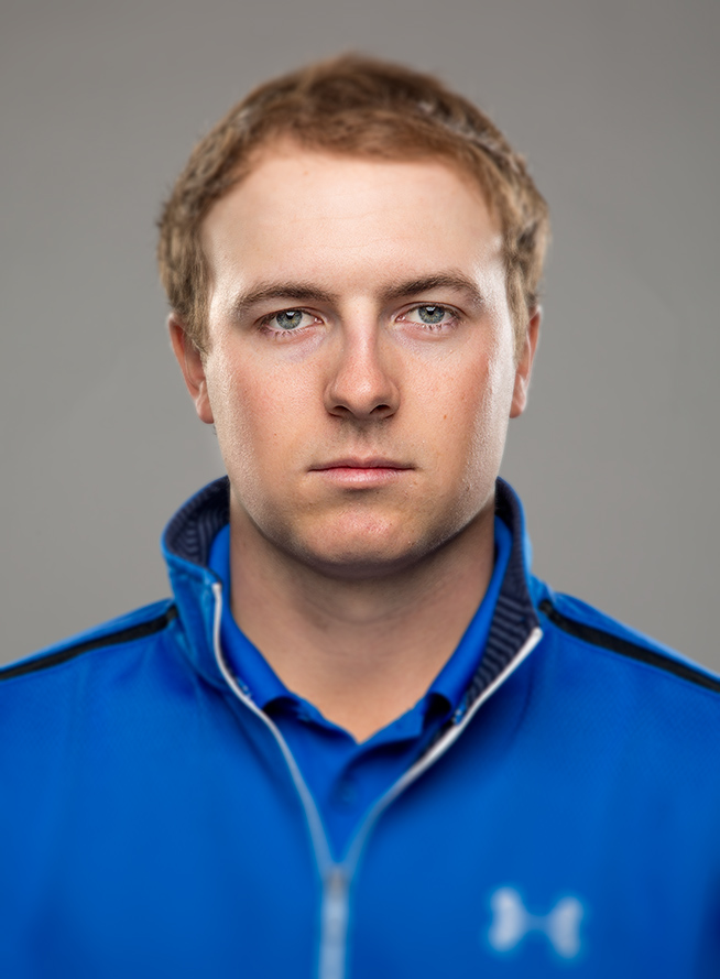
Tight shot of Jordan Spieth during SI photo shoot in Dallas.
Jordan Spieth
A black and white profile of Jordan Spieth during a studio shoot in Dallas.


Sports Illustrated cover shoot with San Antonio Spurs "Big Three"

The final cover treatment, designed by SI Creative director Chris Hercik.

With the NBA Conference playoffs nearing completion and the Spurs already a lock for the Finals, I got a call from Brad Smith, the Director of Photography at Sports Illustrated, asking if I could quickly get to San Antonio. Tim Duncan, Manu Ginobili, and Tony Parker rarely if ever pose together, but had reluctantly agreed to pose for an SI cover which would come out a couple of days later, to coordinate with the beginning of the finals.

Andrew Loehman, a great digital tech/assistant from Austin agreed to sacrifice his Sunday and help us out, and gathered additional gear from Taylor Jones of Texas Grip in Austin. Loaded for bear, Andrew and his wife Chrissy met me in Austin early on a Sunday morning before Spurs practice to scout potential locations.

We knew we would have a mere 5 minutes with the Spurs “Big Three” so we wanted a location from which we could coax multiple looks. Unfortunately, the Spurs Sunday practice was slated for their practice facility, not the arena where they normally play. At the arena, setting up multiple backdrops and lights would be no problem, as there is ample space off the court, under the stands, in high bay loading docks, etc.

The practice facility, though very nice for basketball operations, had no such wide open spaces, and network crews had already commandeered the limited available real estate to shoot their NBA Finals introductions and promo spots for the upcoming TV broadcasts.

The original plan - note: we changed the V-flats out and just used the strips.

It had rained heavily that morning, so outside was not ideal either, although we had a cool corrugated metal wall picked out that would have worked well. Then we saw it…next door to the facility, across a parking lot, was the world’s greatest parking garage! It was the world’s greatest because it was empty and had a 12-14 foot high ceiling – which I’ve never seen before. It would make a great studio. With the help of Spurs PR man Tom James and Facility supervisor Julio Rodriguez, we were able to set up in the garage and prep for the shoot. Power was at a premium, but Julio saved the day (and our bacon) by finding additional avenues and helping us run long cables across the parking lot. We were all set.

Our lovely parking garage studio.....

Brad had mentioned how much they wanted a white background for the shot, so we elected to set up a big Matthews 12 x 12 as our backdrop. We did this instead of just seamless, because it was much more stable in case a gust of wind came through the open garage. We used the seamless for a white floor, and rolled it back to where the silk began. It would require a minor retouch if we shot full length, but it was the safest solution.

Giving the art director options is always a good thing, so we set up our lights so that they could serve dual purposes. Normally, we would set up large foamcore V-flats and stands with regular reflectors bounced into them to light the white background. We decided instead to use two Plume Wafer 140 Medium strip banks to light the white silk from each side. If I turned them off, we would get the same shot with a medium gray background. Then, if they were turned back toward the subjects with Lighttools grids inside, we would get a rimlit version with a black background. Andrew, with the generous help of his lovely wife Chrissy, would drop in a black 8 x 8 Westcott Scrim Jim to make sure the background went black.

So essentially, without moving our subjects, we got six different setups:

1. Boomed key, rimlit, gray background

2. Boomed key, rimlit, black background

3. Boomed key, rimlights off, white background

(reposition players in a row)

4. side key, white background

5. side key, gray background

6. side key, black background

We used two different key lights: A Plume Wafer Hexoval 140 on a boom for most of the shoot, and then a Wafer Hexoval 180 on camera right for the final photo. All of the lights were Profoto: 7A 2400’s for all but one light, which we had to substitute a 7B for when we ran out of power.

Chrissy filling in while we were testing our backlights.

We practiced several times and made careful calculations to determine the number of apple boxes each player would have to stand on to be in the appropriate position. We then choreographed the shoot, making several dry runs in sequence so we would be smooth when the players arrived. We would start with the rimlit gray, then add the black 8 x 8 solid for the rimlit black, then flip the strips around 90 degrees and remove the grids for the all white background, and finishing with the sidelit big Hexoval shot…..all in five minutes!

Soma is defined as effective one for short-term treatment. Please consult with your attending doctor if it is the best choice and remember that it is prescription-only. In terms of quality on website https://buysomapillsonline.com it is proved from our side. Long-term cooperation with the providers brought confidence in them.

The players arrived after practice and we actually got a rare smile out of Duncan, who is normally quite reserved. His kids came with him, and after sharing photos with them on the camera lcd screen, they climbed on my back and were making bunny ears behind my head to get their dad to crack a smile. It was a blast, although tough to keep horizons level when you’re being climbed like a tree.

I rushed back to Houston to file, (you know you’re in a serious rush when you pass both Bucee’s AND Luling City Market BBQ without stopping!) SI Creative Director Chris Hercik whipped up an awesome cover within a few minutes of receiving the photos, using a cool spot-color silver treatment which went great with the black and silver unis.

The black background shot with rim lights.
The white background setup with a smiling Duncan.
Manu goofing off.......
The last shot with a Wafer Hex 180. We shot this with white, gray, and black backgrounds.

David Price for the cover of Sports Illustrated Baseball preview

The final cover shot with blue background added in post by SI imaging.

I recently photographed 2012 Cy Young Award-winning pitcher David Price of the Tampa Rays for the cover of Sports Illustrated’s baseball preview issue. Each year, SI publishes several regional covers for the baseball preview, along with a centerpiece story, and of course all the usual team specific preview spreads. I was fortunate enough to do the Price cover and the opening centerpiece spread story on the Rays pitching staff. Legendary Sports Illustrated Staffer Walter Iooss and longtime staffer Robert Beck shot the other regional covers , so I was in good company!

This was a team effort with different photographers shooting covers in different cities, yet the magazine wanted them to look the same. I was sent a rough comp with a pitcher following through in his delivery, on black, with the broken glass added to the foreground in post. This is not an uncommon assignment, especially in the advertising world, so being able to interpret a comp and match what other photographers have done previously is a useful skill.

The first critical task was finding a place to shoot. Since we were trying to keep these consistent, we needed a large room where we could essentially set up a studio. Spring Training in Florida is often super bright, super windy, and there aren’t many private spaces away from fans and other teammates to do this sort of thing. We essentially needed to build a black box of black fabric 12 x 12‘s to control light in the shoot area, and we were lucky to find a spot in the minor league clubhouse that worked well. Setting up an overhead, a background, and two side 12 x 12’s in the wind and weather was something I was trying to avoid at all costs. You would need a crew of 3-4, and a million sandbags to do that, and we were on a limited budget.

We photographed all five starters in various stages of delivery.

Since we were dealing with white uniforms, and the background was black, I decided to rimlight the pitchers from behind, using two large chimera strip banks oriented vertically on each side and fill from the front. Since we had left handers and right handers, I decided to use two small lightbanks on boomed C-stands positioned close to the ground in front of the pitchers (Chimera mediums I think…I normally use Plume stuff, but these were rentals). We had each light on it’s own Profoto 8A pack so we could shoot everyone fast. We didn’t know when we were setting up if we would get all five pitchers in rapid succession or spread out throughout the day, but we wanted to be ready so that we could maximize our time with them.

We varied the ratio slightly on the front lights depending on whether the pitcher was right or left handed (we just flopped settings on the packs accordingly). By doing this, we were trying to keep them from looking too flat. We also used cinefoil on the bottom third of the front lights to prevent the legs from getting too hot in the photo.

Since we were inside, and not on a mound, we drug the lights outside the night before the shoot and lit a practice mound in the same fashion so we would have foreground plates for the retouchers at SI to use.

We photographed all five pitchers throughout the day, in various stages of their delivery, but when it was David Price’s turn, we asked if he minded shooting a few photos outside. He was relaxed and said sure, so we promptly moved him out to a practice mound outside of the building we were in. We worked quickly and shot him with an Elinchrom Octabank at full power (2400 w/s) to overpower the high 1 PM daylight. Not an ideal situation, but you take David Price whenever you can get him.

With hypochondriac and hysterical reactions, neurosis, dysphoria, phobia, Valium (Diazepam) is taken at 5-10mg 2-3P/day. With alcohol withdrawal syndrome, take 10mg of the drug 3-4P/day in the first 24 hours. In the second and subsequent days, take 5mg 3-4P/day. For weakened and elderly patients, as well as those suffering from atherosclerosis at the beginning of therapy, the drug is prescribed at a dosage of 2mg twicea day.

The next day, we finished the story on Tampa’s pitching factory, shooting a setup with the Tampa manager and pitching coach, and a young prospect, Taylor Guerrieri, mentioned in the story. When we were done with Taylor, we asked him to hang around and pitch in the foreground for us, which made a nice framework for the coach photo…and of course we shot “normal” stuff of both coaches as well.

My favorite Florida assistant, Cy Cyr, was nice enough to join me on this adventure, and helped us out tremendously by renting gear for us from Rummel Wagner at Central Florida Strobe in Orlando.

In the end, SI imaging changed everyone’s backgrounds to blue, and they used a different mound, which was lit a little differently. All the photos were opened up in the shadows so that they were a closer match. The coolest part about SI’s final presentation? If you looked at the magazine on an ipad, you hear breaking glass as the cover appears. Cool.

The same frame as the cover – shown as it was originally shot on black.
This is the outside photo of Price – making the most out of crummy high noon light.
One of our shots of young pitcher Taylor Guerrieri.
Tampa manager Joe Maddon and pitching coach Jim Hickey.

Photographing the Doolittle Raiders 70th Anniversary

In 2011, I was lucky enough to photograph three of the remaining five Doolittle Raiders for a story in Smithsonian Air & Space.  It was an incredible experience and was a wonderful introduction to many wonderful people in the warbird community.

Through some wonderful new friends I met on this assignment, Larry Kelley, a B-25 owner and Doolittle supporter, and Tom Casey, who manages the Raiders’ appearances, I was invited to photograph the Doolittle Raiders 70th Anniversary  April 16-20 at Wright Patterson AFB in Dayton, Ohio.

I jumped at the chance, and was also able to bring my father (a big military aviation buff) with me on the trip to help me (and keep my light stands from blowing over!)

Larry Kelley, who owns and pilots “Panchito”, a vintage B-25 (and the one we used in the Air & Space portraits in 2011), was on a quest to bring a large contingent of B-25’s to Wright-Patt for the anniversary celebration and flyover.  Through tireless fundraising and incredible determination, he was able to get 20 B-25’s and their crews to Grimes Field in Urbana, Ohio  and the Air Force Museum at Wright-Patterson in Dayton for the event.

I had two goals for the event: first, to capture the massive gathering of B-25’s for my friend Larry.  (It was the largest gathering of flying B-25s since the end of WWII!).  Second:  I wanted to photograph a group portrait of all the surviving Raiders together.

Unfortunately, just after I arrived, we found out that one of the surviving Raiders, Lt. Col. Robert Hite, was too ill to travel to the reunion.   We were however,  lucky enough to photograph the other four survivors:  Col. Richard “Dick” Cole, 96, Maj. Thomas C. Griffin, 95, Lt. Col. Edward J. Saylor, 92,  and Staff Sgt. David J. Thatcher, 90.

Time was at a premium, as the Raiders had many different events and appearances scheduled, but I was able to make a group shot with them at Wright Patterson, specifically, the closed runway of the US Air Force Museum, which was temporarily turned into a ramp for 20 B-25’s specially for the event.  The area was open to the public, and there were hundreds of people milling around to view the planes (Picture a busy airshow crowd).  During a brief 2-minute window, we were able (with Larry’s help) to clear a path and photograph the Raiders in front of “Special Delivery”  a B-25 from Galveston, Texas with the Doolittle logo on the nose.   It was a bit unnerving to have an audience of 200 people (and a CBS Evening News crew) over my shoulder watching while we did the picture, but we got it done in record time.

Twenty B-25’s on the old runway at the Air Force Museum at sunrise.

With the help of some generous ramp crew from  the USAFM we were able to secure a jetway ladder and photograph all 20 B-25’s at sunrise the next day.  We then set up another portrait session at the Raiders hotel where I photographed each Raider on white and black backgrounds with old vintage leather A-2 jackets and flyboy caps.  Matt Sager, a photographer/brilliant mechanic from the Panchito crew helped out on both shoots and saved my butt with his Boy Scout preparedness.

The anniversary was an amazing experience, and it’s gotten good play in a few publications in the months following the event, including AOPA Pilot magazine, which ran a series of portraits, and a cool photo I took from the end of the runway during the Grimes Field takeoff.  WWII magazine also ran the group shot we made on the field at the Air Force Museum.  I’ve included some of the tearsheets below.

The four spreads from the AOPA Magazine……I photographed the portraits.
This is the last spread of the AOPA Mag: I was lying down at the end of the runway with a Canon 8-15mm Fisheye as the last plane took off for Wright-Patt from Urbana.
This is the spread from WWII Magazine, published by Weider History Group.


Robert Seale shoots Eadward Muybridge homage

Trevor Bauer’s pitching motion, in an Eadward Muybridge style grid.

Trevor Bauer, a pitching prodigy from UCLA, recently drafted third in the 2011 MLB draft by the Arizona Diamondbacks, is known for his unconventional pitching motion and training philosophy.  He’s been compared to another wildly successful, yet undersized pitcher: Tim Lincecum of the SF Giants, who generates torque by rotating his hips, arms and legs in a whip-like motion, allowing him to pitch as fast as some of his taller, more muscle-bound counterparts in the major leagues.

When I originally got the call to shoot Bauer for Sports Illustrated, the photo editor, Nate Gordon and I discussed shooting a stroboscopic sequence on a black background, much like the work of Life Magazine photographer Gjon Mili.   I had done this type of shot before, in fact my first cover for the Sporting News was a stroboscopic photo of Mets pitcher Pete Harnisch.

My first Sporting News cover: circa 1996.

I first learned about Mili and his work during college.  I took about 27 hours of art history classes  (is that enough for a third major?).   The most memorable one was my mentor, Dr. Michael Roach‘s “History of Photography” class.  Presented chronologically, each class featured a wonderful slide show and biographical talk about pioneering photographers.  Each day we would tackle the work of two-three new photographers, and it was really great to go out and shoot later in the day, channeling the styles you had absorbed by osmosis that morning and trying to emulate that photographer’s look in your own photographs.

It’s great to formulate and grow your own style, but I think it’s equally important to know the history of our craft, learn all those techniques, and have them in your toolbox for when you’re called upon to provide a specific look.

In addition to Mili, one of those early photographers that Dr. Roach introduced us to was the pioneering motion sequence photographer Eadward Muybridge.  Muybridge, using a series of cameras triggered in sequence, put together grids of individual photographs featuring motion studies of humans, horses, and other animals.  There’s not an animator or artist who doesn’t own a dog eared copy of Muybridge’s “The Human Figure in Motion”, first published in 1907.

Anyway, I mentioned I had also been wanting to try a Muybridge homage, and perhaps Bauer’s motion was a good chance to explore the idea.  Nate liked the idea, and after pitching it to Director of Photography Steve Fine, gave me the go ahead to put the shoot together.  One wrinkle in this was that Bauer had not yet been signed to a contract by the diamondbacks at the time of our shoot.  That meant that we had to literally scour the country to piece together a Diamondbacks uniform from several different vendors for him on short notice.

Bauer’s pitching coach Ron Wolforth, helped us find a nearby high school gym to set up the sets for both shots.  Assistant Nathan Lindstrom morphed into a master set builder for this one, designing and erecting a huge plywood wall, that we painted a neutral gray.  We used white tape for the larger grids and chalk pencils for the smaller lines between the grids, and set up the wall in the gym.

Next to that, we erected essentially a cube of black 20 x 20 overheads.  For the Mili shot, it was important that Bauer be rim lit from behind in a pitch black environment.  We used two Plume Wafer 100’s with Lighttools grids to accomplish this, and then added a third light to put a little more light on Bauer’s profile.

For the Muybridge shot, we took off the grids, and lit the set essentially from the front with the lights at 45 degree angles to the wall.  Muybridge’s shots were lit with sunlight, and there were often imperfections and shadows on the walls of his photos, so we didn’t want to make the lighting too slick or neat.  We were going for authenticity.  Both setups were lit with Profoto 8A‘s.

The Bauer pitching sequence shot in our black 20 x 20 “cube.”

We monitored the shoot with a tethered Mac laptop, so we could keep track of sequences and make sure we had all the different body positions needed to put together the Muybridge grid.  With stroboscopic photos of a baseball pitch, you can’t fire the strobe more than 3-4 times, or the picture turns into a big busy mess.  for this reason, we actually shot the photo as a stroboscopic sequence, and also separately with individual photos, which could then be pieced together into a panoramic sequence by a retoucher.

Although the Muybridge homage photo ran in color in the magazine, I actually prefer it in sepia tone, which I think better evokes the mood of his pioneering work in photography.

https://vimeo.com/26410832

(Assistants Nathan Lindstrom and Todd Spoth really busted their tails on this, and Todd put together a great Go-Pro time lapse of the shoot.)